With this division of responsibilities, everyone – from those who knew the project thoroughly to those who only coloured in the buttons – felt sure that the developer would eventually take care of every problem, as he or she simply had no other choice. At the end of the production chain, developers get to deal with all the bugs. It is hardly a surprise that programmers nowadays look down on UX/UI designers, information architects, and managers as nuisances that seemingly have no other purpose than to get in the way of real work.
These occupations have drawn closer to each other in recent years. Development connects with UX, and UI with front-end. The convergence is facilitated, among other factors, by digital design systems, storybooks built to front-end development guidelines, and advanced toolkits such as Figma, Sketch, InVision Studio, and others.
In our business, we are committed to making sure the system works before worrying about how it looks. To help our information architects, UX/UI designers, and developers think uniformly and gain better insight into the customer's needs, we apply a number of different approaches, Object-Oriented UX being one of them.
🔥🔥🔥
Why OOUX?
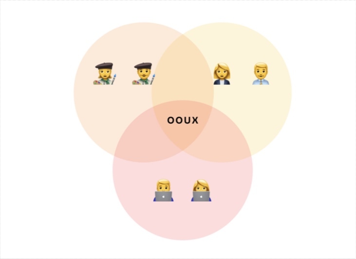
Object-Oriented UX (OOUX) is a development method. It creates a fixed point in the development process where the ideas of all team members – designers, information architects, developers, SEO specialists, and copywriters – converge. For our purposes, ‘design’ will refer more to how the system works than how it looks.
OOUX assists the team in dealing with several crucial tasks.
Defining the correct starting point
Even experienced developers will ask themselves: ‘Where do I begin?’ Imagine you are designing a mobile app to help find homes for cats. Where would you start? Well, you could start by sketching your screens, thinking your structure through, or designing your entities or objects.
What entities will inhabit an app like this? There will definitely be ‘users’, ‘cats’, and ‘orders’. Every user will have a first and last name. Users will have the option of ordering from the product screen or a prior ordering history screen, so later on, we'll need to figure out how this will be reflected in the interface.
OOD provides a base, the ground to stand on while you assemble your construction kit of methods best suited to your specific project.
Economizing
The business analysis (including UX) stage is the cheapest part of system design. This is the phase where team members have fun, generating ideas and boldly scrapping anything that does not fit in.
But the BA stage comes with the costly and complicated sub-process of prototyping. More often than not, it will involve your entire team plus customer-side experts. Prototyping is a long process that generates a large surplus of abstract ideas.
We would think again before letting our designer spend a week creating some deferred payment option that will never be used. OOUX helps to avoid that.
Building an MVP
We work with startups a lot. They often have no money but are strongly motivated to make some. For our part, we are out to make more and do less. It is nothing short of a miracle that our cross-purposes converge in the end.
When your customer is a startup, OOD offers a way to determine what would constitute the Minimal Viable Product (MVP) for the project at hand, and thus, at first, at least, to do strictly what has to be done.
An MVP is the lowest-cost product that is sufficiently effective to benefit the end-user.
One example of an MVP that started as ‘budget’ as they came is Zappos. This online shoe-selling operation took off, galvanizing major investments and ending up among the top online services in its segment. Its founder Nick Swinmurn had nothing but a very basic website at the beginning, where he would post shoe photos taken at local stores to canvass demand. Every time an order was placed, Nick would buy the pair ordered and deliver it to the customer. Without investing in either infrastructure or equipment, Swinmurn successfully cultivated the illusion of a full-service online store, testing the market for his product at next to no cost.
Avoid chaotic to-and-fro
How extremely disappointing it is, having worked extra hard designing all the possible presentations of some pretty complex web pages, to one day realize that the website is irrelevant. It is everyone's wish that these situations occur less frequently and that the team progress smoothly along the path of decomposition from general to detailed.
Designing objects first and user-object interaction flows afterwards spares the developer a great deal of unnecessary work. Until you have decided on the objects you need and listed them, don't worry about what to do with the objects or how to do it.
Thinking this way is not easy: the brain will usually spin its yarn of ideas by itself without being able to stop. When you begin designing a rating service, the idea of adding reviews and a referral program will inevitably pop up next. In the normal course of events, you would want to jump right into the action, irritated with the idea of discussing or analyzing why the proposed action is necessary. You'll have to check yourself (or the customer) and stand firm when this moment comes. Proceed only step by step.
🔥🔥🔥
The first steps in OOUX. Mapping out your objects
The pivotal unit in OOUX is the object. By ‘object’ we mean a logically salient part of the system that can be interacted with and ‘spoken to’ via messages. Every object is an entity with meaningful elements that are manageable from the administrator's control panel.
To put the OOUX method to work on a project, we must first identify all objects in the system and figure out their properties. OOUX involves using a special map that takes several steps to develop.
1. Identifying the objects
First, we need to identify all the objects in our system. This can be accomplished with the aid of user stories – at least, that's how we do it.

As an HR manager, I have to have the option of export a list of all vacancies purchase transactions to prepare my monthly report
Let's imagine we are designing a human resources administration program. The HR manager who will be using the program should be able to export a list of all vacancies purchase transactions to prepare the monthly report.
The objects readily identifiable here are ‘User’ (‘HR Manager’ instance), ‘Transaction’, and ‘Vacancy’. ‘Vacancy’ and ‘Transaction’ are easy: they are very definitely objects acted on within the system.
‘Report’ is a trickier entity. While definitely an object, there is no clarity on whether it should be part of your system. You will understand this better when you have clarified why the user needs the report and how specifically the former interacts with the latter.
It may turn out that what the HR manager intends to do is log on to the existing system, export the raw transaction data in Excel, and then go to the accounting system and prepare the statement there in the customary fashion. Within the scope of the current business process, the option to produce the report in the system you are designing is redundant. In the new system, your job is limited to giving the HR manager the option of exporting the transaction list.
This is where the analyst should ask: if the object ‘Report’ was made part of the new system, would the benefits outweigh the extra investment? Or is this proposition a waste of time, in which case the team should stick to the current implementation plan?
2. Defining object elements and connections
A brainstorming session with your team, with or without the customer, should yield all the pertinent object elements, such as Name, Description, and Date Posted.
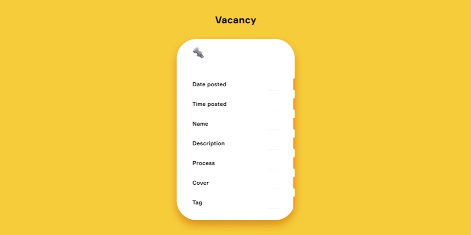
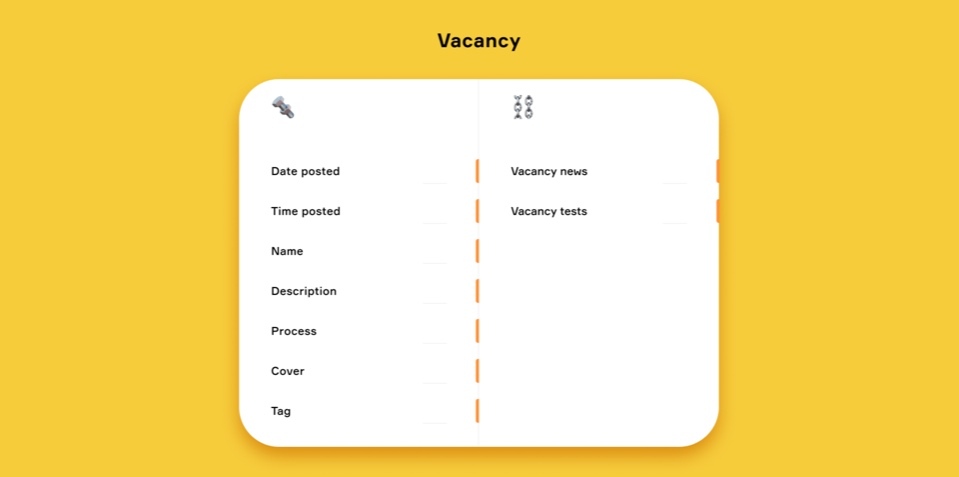
Then we go on to determine the links between our individual objects. For this, the user profiles typically compiled through market research will come in handy.
Every user gets a profile datasheet detailing the applicable scripts and goals. We study them carefully, thinking about what the user would expect from the object, what kind of information they would look for on the page, and what action they would take.
As we brainstormed the script to submit a CV in response to a vacancy ad, for instance, we realized that many applicants may be unaware of their actual qualification level. This holds true for software developers, as every company has a grading system. It is possible that in the company of the employer that posted the ad, the applicant falls short of the Junior level or, conversely, is almost at the Middle level. This led us to augment the website with some tests for applicants to take to determine their qualification level for the particular job they are applying for.
‘Test’ is thus an object in its own right, connected with the ‘Vacancy’ object.
3. Defining interaction options and methods
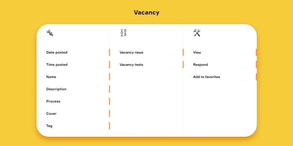
At this point, we take a good look at each object to figure out how it can be acted on. For example, a user may respond to a vacancy ad, save it to favourites, or simply view it.
When we have clarified the options, we can define the interaction flows between the user and the objects. It is the UX specialist's job to find the best solution.
Interaction options are usually brainstormed, and this would be the first brainstorming exercise where at last, the customer starts having fun in the process, which is now all about thinking up features.
The customers will enjoy themselves and have a good time, but they will do so within the framework of a specific object. Thus we get rid of the usual chaos that haunts these kinds of meetings.
4. Defining the element properties
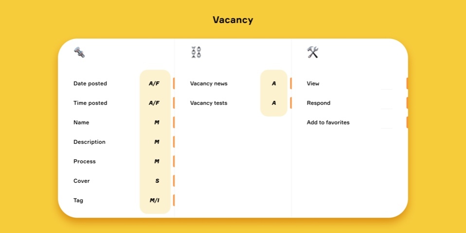
We developed a notation for elements based on their properties.
‘А’ is an automatically generated parameter set by the system without human input. The posting date or time of a vacancy ad is an example of such an element.
‘F’ is a filterable or sortable parameter the user can interact with. For example, the user might have the option to display only those objects that have a particular value for a parameter. An example of this might be a news website visitor who wants to filter the feed to read technology news only.
‘M’ is a parameter set manually by the user and/or system administrator.
‘S’ is a static parameter hard-coded into front-end. It cannot be adjusted. Only the developer can change it.
‘I’ is an internal element. Internal elements are used in large systems that require extra links to organize the internal management of service content and functionality, such as internal tags. A vacancy ad might get a ‘Priority’ tag, allowing the administrator to easily detect all vacancies thus tagged and start processing them as a priority.
Let's mark the elements in our table according to the notation.
5. Defining interaction availability of the functions
For this, we use numerical indicators:
‘0’ - fully available to any user for interaction.
‘1’ - available for limited interaction. At this stage, it does not matter what the limitation is. The important point is that some limitation exists, and they will have to be dealt with in detail during system design.
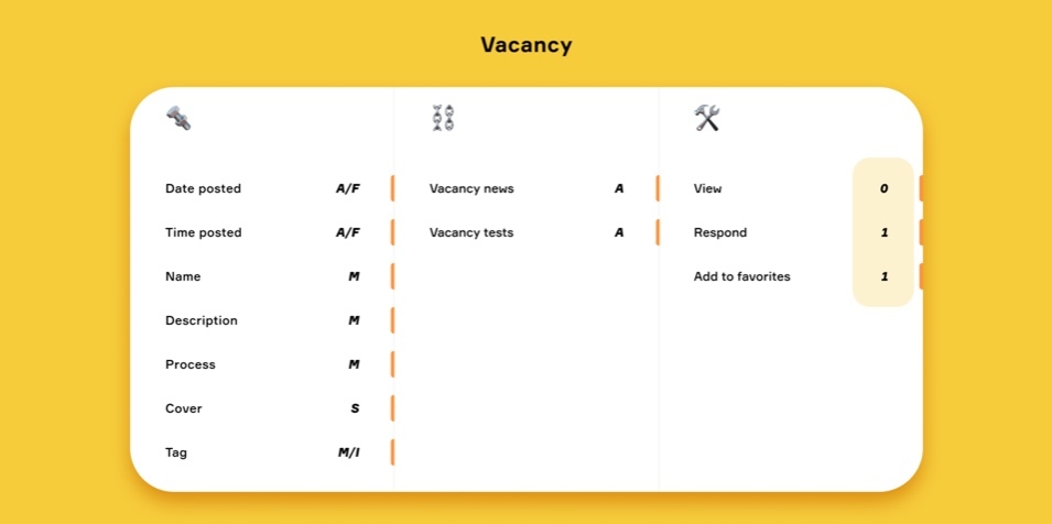
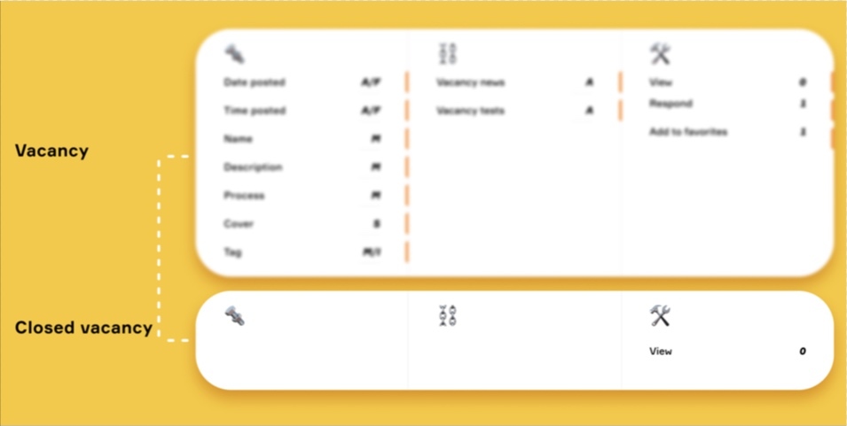
The status of objects may change. A vacancy may be open or archived, but closed vacancies will remain available for viewing. In a graphic presentation, all the interconnected objects of an inactive vacancy will look the same as before, but ‘viewing’ will be the only interaction option left. The ‘respond’ and ‘add to favourites’ options will be gone.
🔥🔥🔥
OOUX at Func: how this works
We have used the system we just described for a few years, but some of our OOUX approaches go more than 6 years back. We have experienced the benefits of OOUX firsthand.
More accurate project estimates
We used to charge fixed rates before, which would hurt when our project estimates turned out wrong.
It is immaterial to the customer whether the outsource contractor can stay within the budget or that some unforeseen but critical work has to be done that will take expenses over the top. The contractor has to deliver the contracted scope of service at the stated price.
We would typically tally new projects by page. We would produce a website map and make it as detailed as possible, but some backend things were likely to fall through the cracks. "Who's making front-end of the administrator panel?" the developer would ask at the very end, only to elicit from the team a startled "What do you mean, making front-end of the administrator panel?"
To get a quote, please, drop us a line.
The practice of OOUX has made our project estimates 20% to 25% more accurate
Using OOUX has helped us improve our project estimate accuracy by 20% to 25%. But most importantly, OOUX gave us a bridge between the project estimate and the work started. If the customer returns within a month of our project estimate, we already have a simplified system model for them, providing a sufficient basis to begin working.
We help startups save money.
Some startup teams know as much about digital product development as I do about ballet dancing, yet they crave the product manager role. Inspired by much-publicized success stories, a startupper might ask us to graft some nice feature onto their website that they had seen on Instagram or Airbnb. Usually, though, when they learn it will cost them $10,000 they change their mind.
Our job is to give customers like these a reality check, and our objects and elements list helps a lot. You can tell them, 'Look, if we add element X, that's another $5,000, but if we remove element Y, that's $3,000 less'. This usually makes the customer happy – it's nice to save $3,000.
And on our products development service page, you can get all the details.
More productive brainstorming
There are all kinds of customers out there. Experts occasionally approach us, and we enjoy learning from them. But there is a certain type of customer from the small business community… To say they know nothing about technology would be an overstatement. Brainstorms with these people are challenging, but OOD helps keep them in shape.
Our brainstorms take 40 to 60 minutes now, as opposed to 2.5 to 3 hours before OOUX
We grab user personas, put the datasheet on the table, and discuss just one object the whole time, such as "how Jack interacts with 'Vacancy'". The customer has no leeway to become distracted or digress. Our brainstorms used to last 2.5 to 3 hours; now, 40 to 60 minutes is all it takes.
We have knowledge sharing now
We have set up continuous knowledge sharing between our teams without coercion.
The practice of OOUX calls for a uniform shared document containing all key product knowledge. Team members usually join the project once there are clear outputs from the preceding phases and a task specification is ready for their part of the job. With OOUX, all project members can get on board a lot earlier, which means they will also detect inconsistencies much earlier. Those can and ought to be discussed immediately and followed up with the appropriate changes to the design and documentation. We are all familiar with the onerous unpleasantness that ensues from errors unexpectedly discovered in an SRS that has already been agreed upon with the customer, and we know how reluctant the project team will be to make even direly necessary changes in the design.
The content design comes easier.
We work with SEO partners who help us with the correct page decomposition. They figure out the pages that will be merged and those that will get their interfaces, and also generally design the right structure for the search engine. With OOUX, they can do their part of the work concurrently with our development.
This saves the customer some anxiety. Regular people, myself included, have no idea what the job of an SEO specialist is. To us, it looks like they do some magic for a month and then get paid. The customer is usually in no mood to waste a whole month on some obscure magic, so now we have an instrument that allows everyone to work together simultaneously, jumping off of a single document.
It is also important that the copywriters get involved in the process at an early phase in the design. The way it used to be before OOUX, all that a copywriter could do before the actual website design kicked off would be to think through the strategy and the tone of voice. Now they can handle a lot more. They will build text structure for every object (being aware, from the get-go, of the object elements and interaction flows), produce drafts, and state their wishes and requirements for the composition of objects.
🔥🔥🔥
Instead of a conclusion
OOUX is just one design process. It is very helpful, but it cannot supersede everything else. We typically employ OOUX for large, content-heavy websites or products when the system is too big to mentally keep track of everything.
It is hardly worth your while to use OOUX on small corporate websites a few pages long. Those usually come with a few patently obvious objects or none at all. You don't need a separate, dedicated process to deal with that.
It is also important to ensure that the documents generated in the process are updated in a timely fashion and remain available to the entire team. Unless this is done, the OOUX will remain on paper only – neither the developers, the copywriters, nor the designers will want to be part of it.
The same approach may also work for internal customers, but the line of argument will be different: ‘We would save 50 man-hours of design work by removing this feature’.
🔥🔥🔥
Further reading on OOD
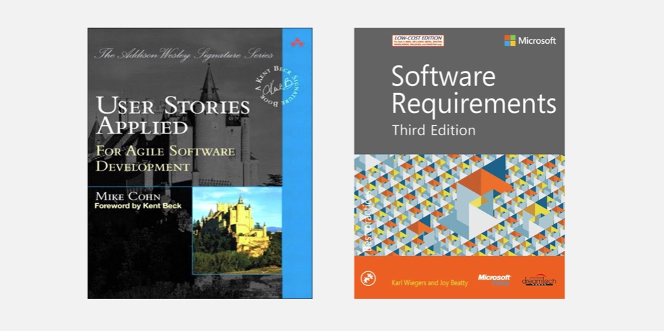
OOUX articles by Sophia V. Prater
Sophia keeps a UX design blog. I have learned a lot from her. I was surprised to discover how similar, and yet how different, our thinking is.Software Requirements by Karl Wiegers
A must-read for every systems analyst and software designer. I mean it – simply the best! The seminal book for our profession, in my opinion.User Stories Applied by Mike Cohn
An all-encompassing book on user stories – the best one out there. Reads like a breeze: you will probably finish it in one night. It showcases the whole process, from user story logging to development to testing.


